Speechace slide deck
a fresh take
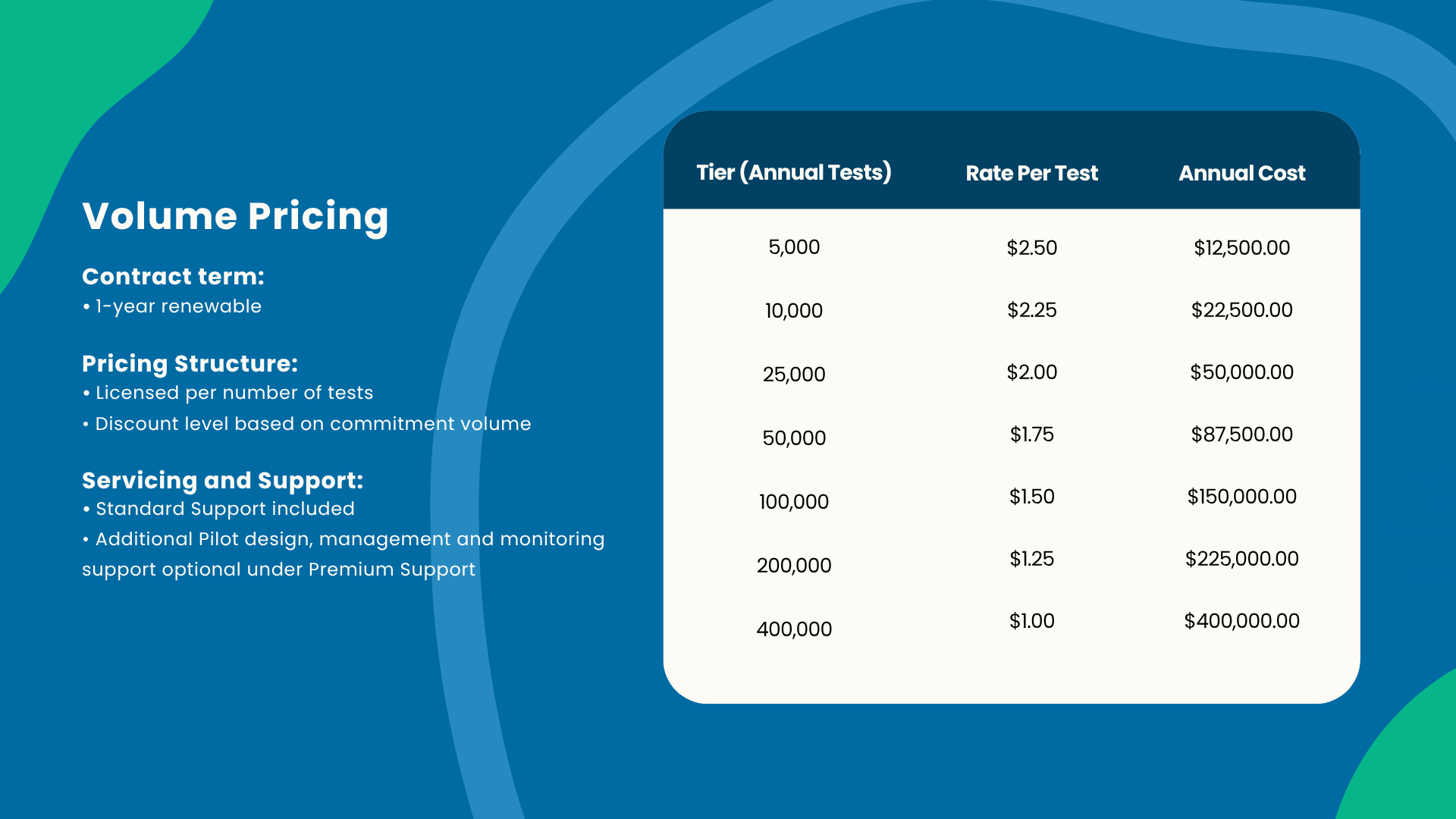
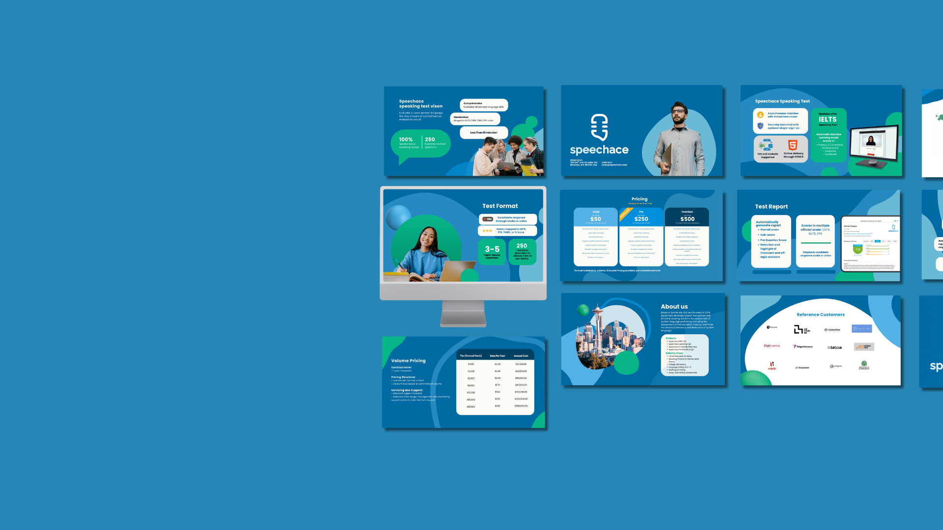
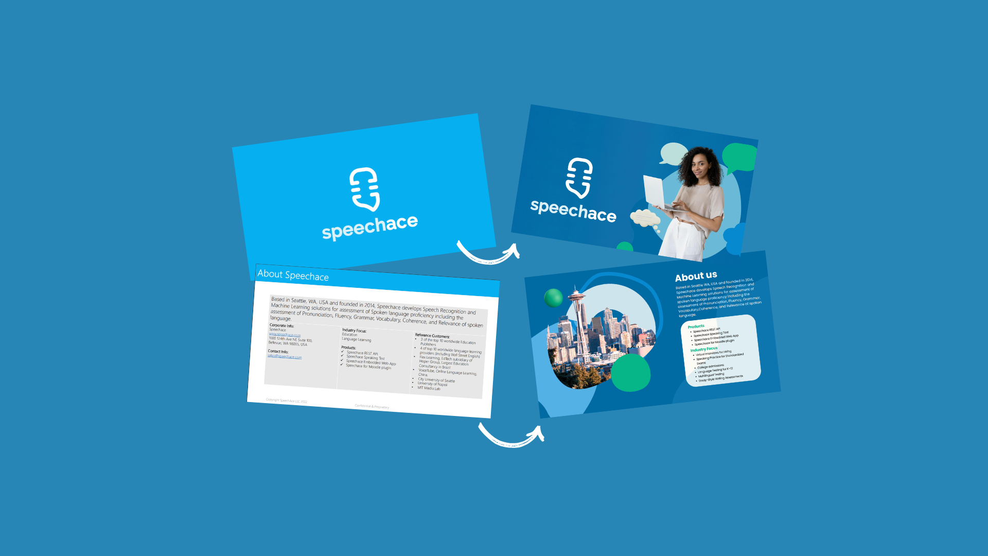
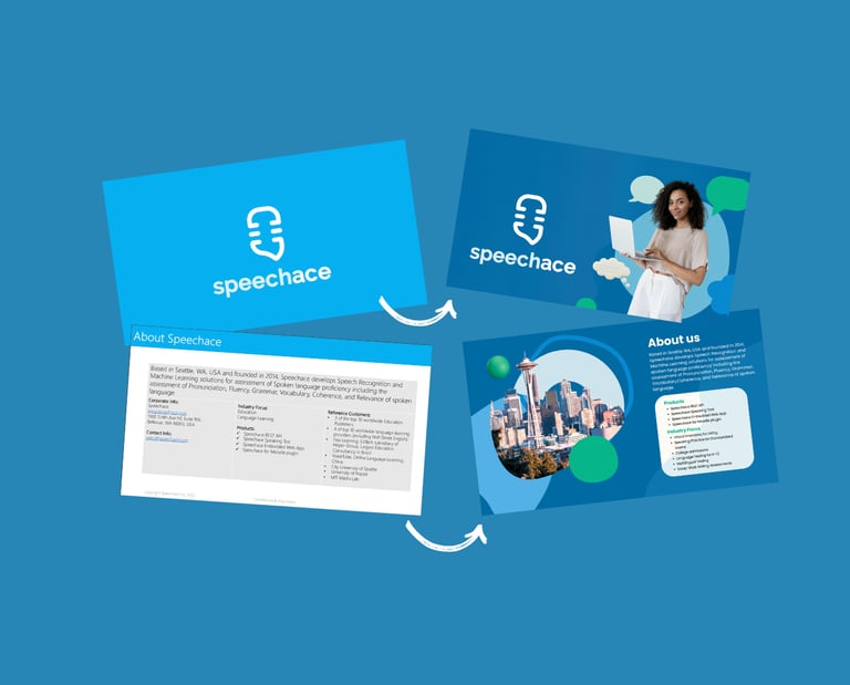
I redesigned the Speechace Speaking Test presentation to improve clarity, consistency, and visual impact while keeping it fully aligned with the company’s brand identity. The goal was to transform dense technical information into a clean, modern, and engaging 15-slide narrative that highlights Speechace’s AI-powered language assessment technology.
My approach focused on:
Streamlining content into clear, story-driven sections
Applying consistent typography, spacing, and color hierarchy
Introducing visual balance through white space and branded iconography
Enhancing readability and flow for both internal and external audiences
The final result presents a cohesive, on-brand deck that communicates Speechace’s value with confidence and professionalism.